DISTRIBUTE
DISTRIBUTE
DISTRIBUTE
Distribute is a custom user interface tailored for the needs of Bank of America’s Risk & Finance Technology (Credit Risk) department. The whole process of designing for this application in itself required the design of a process for this product! My role here was the sole lead UX designer in facilitating and fashioning the process and delivery of design and UX standards for business and tech. Tech Stack: React
Distribute is a custom user interface tailored for the needs of Bank of America’s Risk & Finance Technology (Credit Risk) department. The whole process of designing for this application in itself required the design of a process for this product! My role here was the sole lead UX designer in facilitating and fashioning the process and delivery of design and UX standards for business and tech. Tech Stack: React
Service
Service
Web Design
Web Design
Role
Role
Lead UX
Lead UX
Tools
Tools
HTML / AXURE / ILLUSTRATOR
HTML / AXURE / ILLUSTRATOR

THE PROBLEM - No such application existed prior to this to manage this complex relationship - A solutions were required to manage and automate flows of information between data warehouses by leveraging the powerful Apache NiFi “Dataflow” software’s API while providing an easy-to-use, secure and extensible UI. - The research plan and discovery methodology on where to begin the ideation process was needed to be defined TAKEAWAY - The solution lay in designing both the process and product for impact - Design, Product and Tech clearly needed to share a common vision for discovery, build, test and iterate process with no previous references.
THE PROBLEM - No such application existed prior to this to manage this complex relationship - A solutions were required to manage and automate flows of information between data warehouses by leveraging the powerful Apache NiFi “Dataflow” software’s API while providing an easy-to-use, secure and extensible UI. - The research plan and discovery methodology on where to begin the ideation process was needed to be defined TAKEAWAY - The solution lay in designing both the process and product for impact - Design, Product and Tech clearly needed to share a common vision for discovery, build, test and iterate process with no previous references.

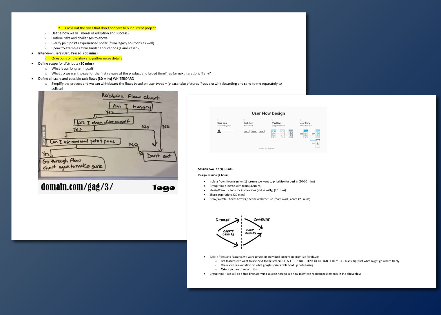
METHODOLOGY - The process was key to the solution - The ideation/discovery part of the process was kicked off by a modified design spring compressed into 2 days. - With a unique set of scheduling, spread locations and budget challenges between engineering, product we designed a workshop using low tech workarounds using facetime, whiteboards and pleaty of prep in advance. - Group discovery, focus groups and participatory design were considered for effciency - Rapid prototypeing was to be used for testing - Users/roles/groups needed to be clearly defined - Mapping out task flows, feature lists and jouney maps was seen as important As both the problem and the end users were product and tech we needed to identify and align the objectives between all the team members.
METHODOLOGY - The process was key to the solution - The ideation/discovery part of the process was kicked off by a modified design spring compressed into 2 days. - With a unique set of scheduling, spread locations and budget challenges between engineering, product we designed a workshop using low tech workarounds using facetime, whiteboards and pleaty of prep in advance. - Group discovery, focus groups and participatory design were considered for effciency - Rapid prototypeing was to be used for testing - Users/roles/groups needed to be clearly defined - Mapping out task flows, feature lists and jouney maps was seen as important As both the problem and the end users were product and tech we needed to identify and align the objectives between all the team members.

DISCOVERY / IDEATION Using contextual inquiries we identified the following business requirements for "Distribute" which fundamentally was a very complex tech application. - Need to automate how data is moved around systems - No custom development-clear standards and clear UI - Users were Dev (admin), Data Subscribers, Publishers and EDM users (with focus on metadata) - Existing solutions were too monolithic and specific - Goal was have a 100% adoption by users - Design solutions needed to modular and extensible. There are 4 main resources: - Applications (or “Systems”) - Publications - or “Tasks” that produce data and send it to an application - Subscriptions - or “Tasks” that consume data from an Application - Datastores - or “Data Sources” in the case of publications and “Data Targets” in the case of subscriptions.
DISCOVERY / IDEATION Using contextual inquiries we identified the following business requirements for "Distribute" which fundamentally was a very complex tech application. - Need to automate how data is moved around systems - No custom development-clear standards and clear UI - Users were Dev (admin), Data Subscribers, Publishers and EDM users (with focus on metadata) - Existing solutions were too monolithic and specific - Goal was have a 100% adoption by users - Design solutions needed to modular and extensible. There are 4 main resources: - Applications (or “Systems”) - Publications - or “Tasks” that produce data and send it to an application - Subscriptions - or “Tasks” that consume data from an Application - Datastores - or “Data Sources” in the case of publications and “Data Targets” in the case of subscriptions.

IDEATION WORKSHOP INSIGHTS We facilitated a 2 day ideation sprint based on google sprint using the google sprint methodologies as a reference. From brief SME insights to warm up ideation exercises using crazy 8's and dot voting with both tech and product we were able to throw up solution insights and ideas for Distribute. We posed an analogous problem by asking the team to re-imagine / HMW optimize and or simplify legacy office / mail distribution spaces to make the deliveries more effcient? The workshop results threw up some amazing insights from the team. A lot of them centered on solutions that highlighted a flexible alternative approaches to mail distribution by doing away with the structured need for a physical space. This then informed our initial design in making a choice to explore layout which didn’t have a structured or a conventional menu.
IDEATION WORKSHOP INSIGHTS We facilitated a 2 day ideation sprint based on google sprint using the google sprint methodologies as a reference. From brief SME insights to warm up ideation exercises using crazy 8's and dot voting with both tech and product we were able to throw up solution insights and ideas for Distribute. We posed an analogous problem by asking the team to re-imagine / HMW optimize and or simplify legacy office / mail distribution spaces to make the deliveries more effcient? The workshop results threw up some amazing insights from the team. A lot of them centered on solutions that highlighted a flexible alternative approaches to mail distribution by doing away with the structured need for a physical space. This then informed our initial design in making a choice to explore layout which didn’t have a structured or a conventional menu.
VERSION A SOLUTION The Version A design was desined to be a SPA (single page application) type of a dashboard. Instead of relying heavily on pages (“page based application”), the initial design relied on views and widgets: panel, dialog and drawer. Through the process the design pivoted to a multi page design with user feedback. The view presnted is comprised of 3 panels with contextual menu’s contained in each panel. There was a dashboard, application panel, task panel and a configuration panel (contained inside a retractable right drawer) Each panel had contextual menu's and allowed the user to view high level summaries as well as details. - The “application” panel would provide summary and details for your applications with an overview across the system. - The task panel provide details on the deliveries, publications and subscriptions while allowing the user to create new subscriptions or publications across the system. - The connections panel allowed for new connections and view or approve workflows based on roles and permissions. We developed interactive design prototypes with micro interactions for various features in design sprints. These were then tested with diff user groups using lo-fi prototypes over iterative presentations. Usability testing with complex and specific design comes with unique challenges unlike with consumer applications as there are multiple perspectives across geographies. The feeback received was very varied opnions from different user groups. The early feedback clearly highlighted that while users were able to accomplish everything on this page both the technical and UX design seemed to be catering to several edge case scenarios and the UI was complex. We collectively decided to pivot based on this crucial feedback to a more conventional approach.
VERSION A SOLUTION The Version A design was desined to be a SPA (single page application) type of a dashboard. Instead of relying heavily on pages (“page based application”), the initial design relied on views and widgets: panel, dialog and drawer. Through the process the design pivoted to a multi page design with user feedback. The view presnted is comprised of 3 panels with contextual menu’s contained in each panel. There was a dashboard, application panel, task panel and a configuration panel (contained inside a retractable right drawer) Each panel had contextual menu's and allowed the user to view high level summaries as well as details. - The “application” panel would provide summary and details for your applications with an overview across the system. - The task panel provide details on the deliveries, publications and subscriptions while allowing the user to create new subscriptions or publications across the system. - The connections panel allowed for new connections and view or approve workflows based on roles and permissions. We developed interactive design prototypes with micro interactions for various features in design sprints. These were then tested with diff user groups using lo-fi prototypes over iterative presentations. Usability testing with complex and specific design comes with unique challenges unlike with consumer applications as there are multiple perspectives across geographies. The feeback received was very varied opnions from different user groups. The early feedback clearly highlighted that while users were able to accomplish everything on this page both the technical and UX design seemed to be catering to several edge case scenarios and the UI was complex. We collectively decided to pivot based on this crucial feedback to a more conventional approach.

THE DESIGN PIVOT - VERSION B In the new design we introduced a more structured approach with the use of a simple left main menu and secondary menus where required. User would view the information at a glance and be able to view/edit details of the publication or subscription via a slide-in right drawer. With the database slection, users had the options in left menu and the publications/subscription as secondary menu's in center. With each publication the configuration options and details were displayed to the right using a slide-in drawer This completely simplified the whole approach for both tech and UX design and simplified the congnitive overload. The feedback was extremely positive.
THE DESIGN PIVOT - VERSION B In the new design we introduced a more structured approach with the use of a simple left main menu and secondary menus where required. User would view the information at a glance and be able to view/edit details of the publication or subscription via a slide-in right drawer. With the database slection, users had the options in left menu and the publications/subscription as secondary menu's in center. With each publication the configuration options and details were displayed to the right using a slide-in drawer This completely simplified the whole approach for both tech and UX design and simplified the congnitive overload. The feedback was extremely positive.

STANDARDS & SPECIFICATIONS The BOA credit risk technology division had no enterprise level UX standards at all in place. The task was two fold - to create standards for Distribute and then adopt those for all new projects while trying to retrofit them to other applications in production as well. The strategy I adopted was by addressing the standards address common components which then laid the benchmark standards for their Risk Finance UX applications. I also leveraged and extended existing standards that were in place by the consumer side UX teams. From type, forms to basic errors and validations and micro-interactions and UX patterns these standards were the start Both the distribute prototype and standards were tested and socialized across the diffrent teams and user groups for early adoption.
STANDARDS & SPECIFICATIONS The BOA credit risk technology division had no enterprise level UX standards at all in place. The task was two fold - to create standards for Distribute and then adopt those for all new projects while trying to retrofit them to other applications in production as well. The strategy I adopted was by addressing the standards address common components which then laid the benchmark standards for their Risk Finance UX applications. I also leveraged and extended existing standards that were in place by the consumer side UX teams. From type, forms to basic errors and validations and micro-interactions and UX patterns these standards were the start Both the distribute prototype and standards were tested and socialized across the diffrent teams and user groups for early adoption.


