RFQ
RFQ
RFQ
RFQ (Request for Quote) tickets are used by traders to get competitive quotes from providers for specific assets. This project/ticket was designed at Barclays for the eRates trading application. RFQ tickets are used for pricing information before executing a trade. My role here as the sole lead UX designer was to find common ground, facilitate and manage conversations between the product teams and tech while designing solutions that met all their differing requirements. Operating Environment: Openfin Tech Stack: Angular JS.
RFQ (Request for Quote) tickets are used by traders to get competitive quotes from providers for specific assets. This project/ticket was designed at Barclays for the eRates trading application. RFQ tickets are used for pricing information before executing a trade. My role here as the sole lead UX designer was to find common ground, facilitate and manage conversations between the product teams and tech while designing solutions that met all their differing requirements. Operating Environment: Openfin Tech Stack: Angular JS.
Service
Service
Application Design
Application Design
Role
Role
Lead UX Design
Lead UX Design
Tools
Tools
Figma
Figma

THE CHALLENGE The challenge was to develop a modular ticket that met the widely differing needs of the Developed Markets (DM) and the Emerging Markets (EM). The RFQ tickets to be designed were from RFQ, RFM, (Outrights, Spreads and Fly's as well as for Swaps and Bonds). The goal was to make it effcient and minimize custom development and those high overheads required to maintain the bespoke ticket designs. From a UX point of view there was the drive to main consistency in look/feel of the ticket and use of common components in RFQ and RFM outrights, spreads and butterfly tickets The key challenge for design was to reconcile the views for UX and to bring alignment in every respect - Traders as end users are very unique power users and very opinionated. - Traders are loathe to provide research time as their use of time and priorities are very different - Screen estate and information density and the way information is presented is extremely crucial. - Traders prefer using their "muscle memory" as a preference for recognition over recall. - A screen is never complete if the data used does not simulate their reality or understanding.
THE CHALLENGE The challenge was to develop a modular ticket that met the widely differing needs of the Developed Markets (DM) and the Emerging Markets (EM). The RFQ tickets to be designed were from RFQ, RFM, (Outrights, Spreads and Fly's as well as for Swaps and Bonds). The goal was to make it effcient and minimize custom development and those high overheads required to maintain the bespoke ticket designs. From a UX point of view there was the drive to main consistency in look/feel of the ticket and use of common components in RFQ and RFM outrights, spreads and butterfly tickets The key challenge for design was to reconcile the views for UX and to bring alignment in every respect - Traders as end users are very unique power users and very opinionated. - Traders are loathe to provide research time as their use of time and priorities are very different - Screen estate and information density and the way information is presented is extremely crucial. - Traders prefer using their "muscle memory" as a preference for recognition over recall. - A screen is never complete if the data used does not simulate their reality or understanding.

DISCOVERY - At the outset we found that the RFQ tickets for the EM and DM traders were unique and built out in siloed teams - Inconsistent look and feel and multiple components unique to their domains - Tickets are acted on within a minute or left alone/rejected - Tickets are auto generated and appear on screen though expired tickets can be viewed via a blotter - Multiple tickets are displayed on the screen at various stages and time to accept, reject or ignore is crucial. - The ability read and digest the information quickly was important - Component needed design to avoid fat finger errors was equally important - Tickets went through several stages from "New" to "Done" and "Expired" in a journey - Design was led by competing product owners and the process and tickets were in production and constant upgrades leading to high costs for development. - Their current use and references for tickets came from the 3rd party services and so customizing the RFQ ticket was a priority
DISCOVERY - At the outset we found that the RFQ tickets for the EM and DM traders were unique and built out in siloed teams - Inconsistent look and feel and multiple components unique to their domains - Tickets are acted on within a minute or left alone/rejected - Tickets are auto generated and appear on screen though expired tickets can be viewed via a blotter - Multiple tickets are displayed on the screen at various stages and time to accept, reject or ignore is crucial. - The ability read and digest the information quickly was important - Component needed design to avoid fat finger errors was equally important - Tickets went through several stages from "New" to "Done" and "Expired" in a journey - Design was led by competing product owners and the process and tickets were in production and constant upgrades leading to high costs for development. - Their current use and references for tickets came from the 3rd party services and so customizing the RFQ ticket was a priority

METHODLOGY / PROCESS / WIREFRAME STRATEGY - Research and getting buy-ins from Trader was crucial - We decided to test ideas by rapid prototyping but getting feedback and or time was always diffcult - The tickets needed to be modular so we could mix and match common components to match specific requirements - In order to get around the rapid feedback loop challenge, we built each ticket by proving end users with controls in turning things on/off to help them visualize options at the design stage -Group discovery and focus groups were difficult to use in this context but participatory design where they had control over shaping the direction directly became the key that opened the door for rapid feedback. - Prototyping based on the journey from generation of a "new" ticket to "expired" was required. - Contextual discovery, contextual research, participatory design was the ONLY way forward!
METHODLOGY / PROCESS / WIREFRAME STRATEGY - Research and getting buy-ins from Trader was crucial - We decided to test ideas by rapid prototyping but getting feedback and or time was always diffcult - The tickets needed to be modular so we could mix and match common components to match specific requirements - In order to get around the rapid feedback loop challenge, we built each ticket by proving end users with controls in turning things on/off to help them visualize options at the design stage -Group discovery and focus groups were difficult to use in this context but participatory design where they had control over shaping the direction directly became the key that opened the door for rapid feedback. - Prototyping based on the journey from generation of a "new" ticket to "expired" was required. - Contextual discovery, contextual research, participatory design was the ONLY way forward!
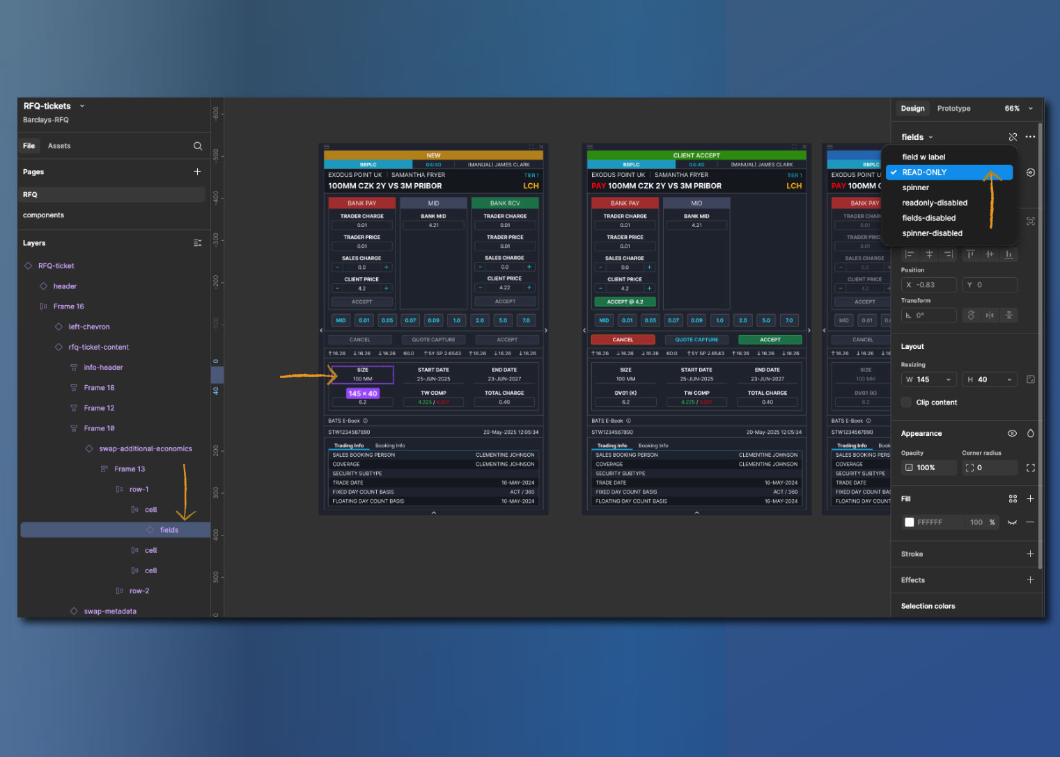
- We built the design using the existing design library and standards - The tickets were ideated and then we made the elements into components once a common pattern was agreed on - Based on requirements for MVP1 and 2, switches and toggles were built into the inspectors on right so users could take each ticket and turn things on/off and make choices
- We built the design using the existing design library and standards - The tickets were ideated and then we made the elements into components once a common pattern was agreed on - Based on requirements for MVP1 and 2, switches and toggles were built into the inspectors on right so users could take each ticket and turn things on/off and make choices

With multiple iterations and rapid iterative testing with all product groups we arrived at a common agreed on UX pattern. - The top half of the ticket would be used for ticket information ,status, salesperson and venue details etc. - The middle was the interaction and buttons. - The bottom was for additional economic information with accordian panels for supplmentary information on user request
With multiple iterations and rapid iterative testing with all product groups we arrived at a common agreed on UX pattern. - The top half of the ticket would be used for ticket information ,status, salesperson and venue details etc. - The middle was the interaction and buttons. - The bottom was for additional economic information with accordian panels for supplmentary information on user request

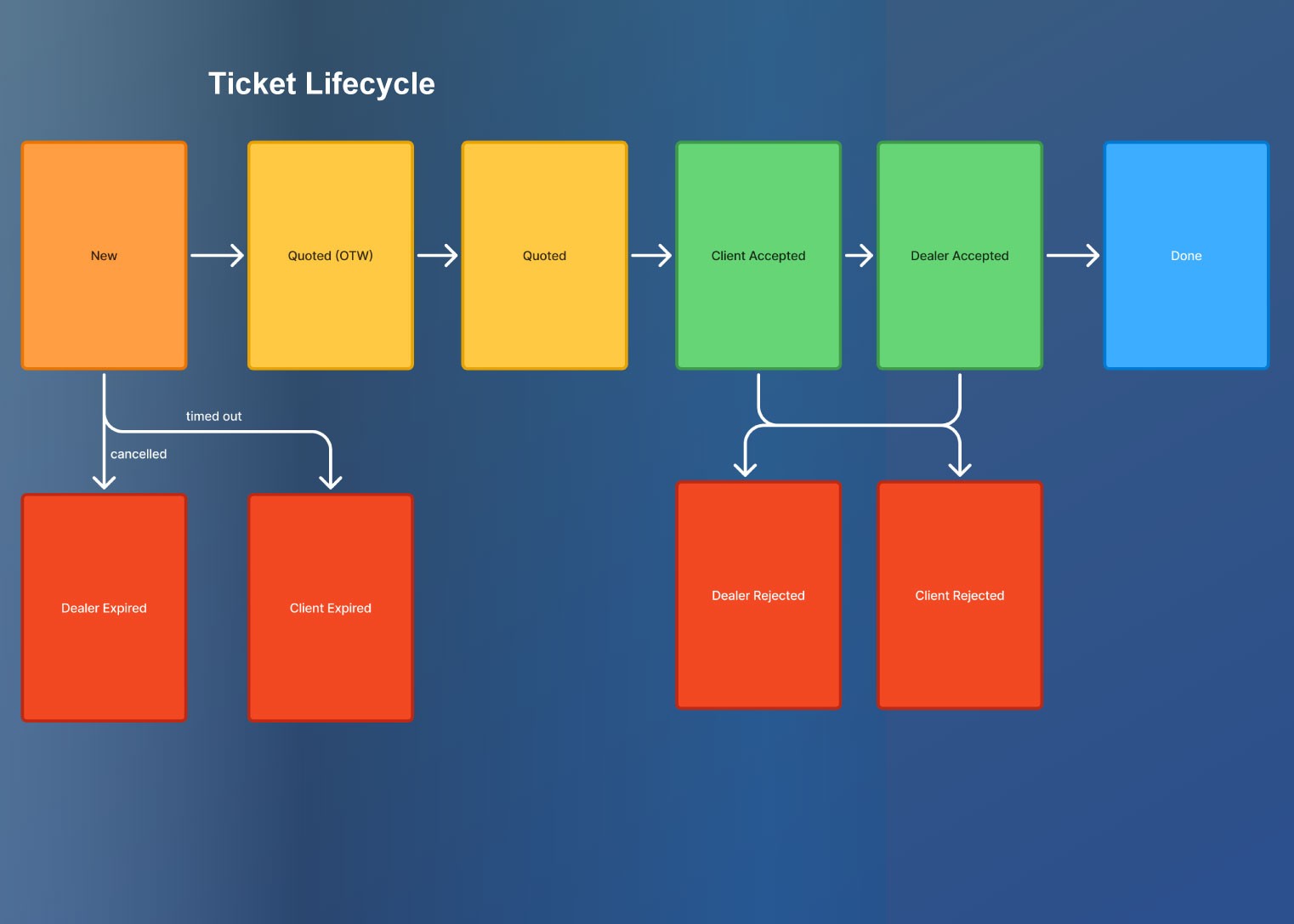
Documenting the lifecycle of each ticket as it moves from "new" to "done" or expired was itself a complex task. Users were familiar but for all others we need to doument it to replicate and or tweak it based on the opportunities presented. this was crucial as it helped up prototype the ticket
Documenting the lifecycle of each ticket as it moves from "new" to "done" or expired was itself a complex task. Users were familiar but for all others we need to doument it to replicate and or tweak it based on the opportunities presented. this was crucial as it helped up prototype the ticket
IMPACT - The biggested take away from this process was the process itselft. Providing controls to the end users to help them visualize the product laid the pathway for future innovation the stakeholders were very positive - Prototyping and ability to visualize was the biggest takeaways - While they were gaps in the engineering perfomance the design and layout was received positively - There is an ongoing process on measuring the effciency as well currently
IMPACT - The biggested take away from this process was the process itselft. Providing controls to the end users to help them visualize the product laid the pathway for future innovation the stakeholders were very positive - Prototyping and ability to visualize was the biggest takeaways - While they were gaps in the engineering perfomance the design and layout was received positively - There is an ongoing process on measuring the effciency as well currently


